From overlooked to impossible to ignore on the Indian snack shelf.
First Launch redesigned Svaras's khakhra packaging from first principles — studying the category, developing three competing design directions, and delivering a scalable system that competes on the same shelf as Lay's, Doritos, and Bingo.
Packaging that was working against the product.
In a category where most purchase decisions happen in seconds at the shelf, visual presentation is not secondary — it is the sale.
Svaras offers handcrafted khakhra — a traditional Indian snack rooted in Gujarati culinary culture — to a growing urban audience looking for credible alternatives to processed chips and wafers. The product itself is genuinely differentiated: handcrafted, flavourful, culturally rooted. But the packaging was failing to communicate any of that.
In a snack category dominated by Lay's, Doritos, Bingo, and Too Yumm! — brands with high-contrast, bold packaging systems built to command shelf attention — Svaras's visual presentation lacked the visibility, flavour differentiation, and competitive energy needed to convert a browsing shopper into a buyer.
The gaps were specific: no strong shelf visibility from a distance, no coherent system for distinguishing flavours visually, no contemporary aesthetic resonant with a younger urban consumer, and no visual language capable of sitting alongside established national brands without being overlooked. Most snack buying decisions are made at the shelf, in seconds, on visual impact alone. A pack that doesn't perform in that moment loses the sale before the consumer has read the brand name.
The brief required solving all of this simultaneously — modern enough for young urban buyers, culturally rooted enough to honour the product's Indian identity, distinctive enough to stand out in a crowded aisle, and scalable enough to work as a design system across future SKUs.
What the category taught us before design began.
First Launch studied the visual language of the brands Svaras would compete with on shelf. Four consistent principles emerged — and became the functional requirements for every concept developed.
Three directions. One brief. Full design territory mapped.
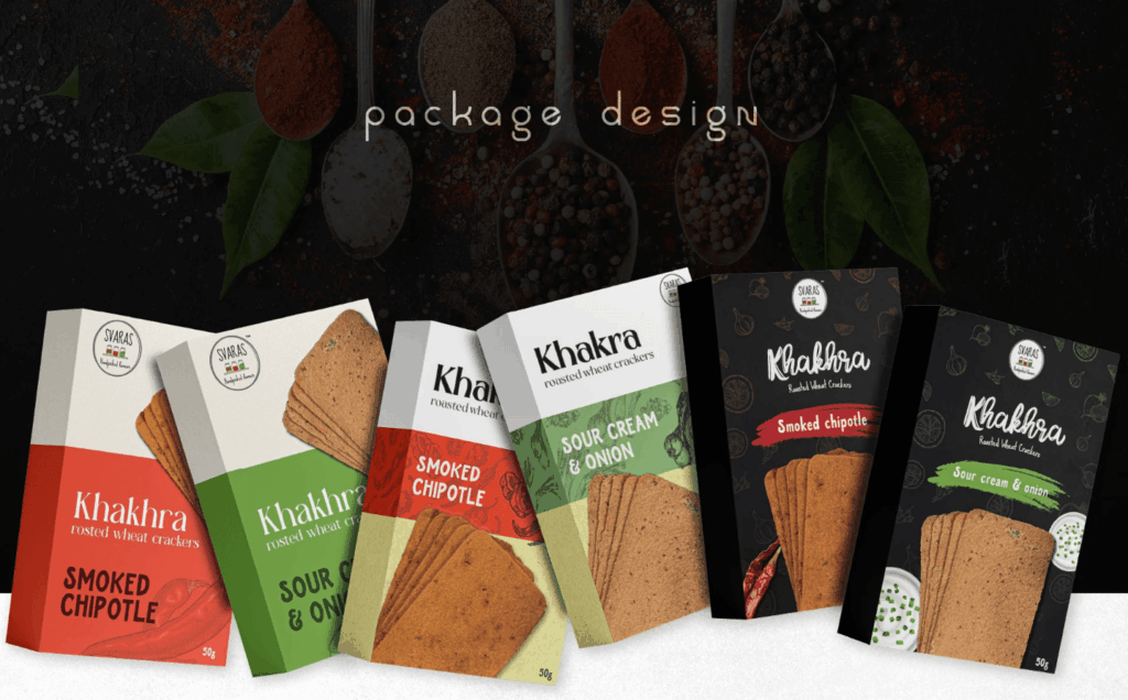
First Launch developed three distinct design directions for Svaras — not to offer arbitrary options, but to map the full strategic range available to the brand before committing to a direction.
- Best suited for premium and gourmet retail positioning
- Dark base amplifies flavour colour contrast dramatically
- Cultural texture without traditional visual weight
- Fastest purchase decision pathway of the three directions
- Product imagery drives appetite appeal immediately
- Optimised for organised retail and quick-scan environments
- Strongest balance between modern clarity and cultural identity
- Colour blocking creates immediate shelf differentiation
- Minimal visual noise maximises flavour legibility at distance
Built to scale across every SKU Svaras will ever launch.
Across all three concepts, First Launch built a consistent underlying architecture — a design system that lets Svaras expand its range without losing visual coherence.
Typography was built around a bold, legible product naming hierarchy with clear flavour emphasis — the brand name and flavour variant each readable instantly at different viewing distances. The system prioritises hierarchy over decoration: every typographic decision serves the shelf performance requirements identified in the competitor analysis.
The colour palette is anchored in deep black and white as base tones, with flavour-specific accent colours — green for Sour Cream & Onion, red for Smoked Chipotle — forming the SKU differentiation system. The architecture is deliberately extensible: adding a new flavour to the range requires introducing one new accent colour within the same system, not redesigning from scratch. Every structural element — the flavour band, product imagery zone, brand name placement, ingredient motif — remains consistent. Only the accent colour changes.
Packaging features built into the system include flavour-coded SKU differentiation, large appetite-driven product visuals, ingredient-led supporting graphics that reinforce flavour association, and a scalable architecture designed for Svaras's full future product range.
Lean too far toward tradition and the product gets overlooked by younger buyers. Lean too far toward modern and the brand loses the credibility that makes it different from any other snack on the shelf.
Questions about packaging design for FMCG brands
Common questions about First Launch's packaging design and brand visual identity work for consumer and F&B brands.
-
Most snack buying decisions are made at the shelf in seconds, based on visual impact alone — the consumer picks up the pack before they've consciously evaluated the brand. In a category where Lay's, Doritos, and Bingo have spent decades optimising their packaging for shelf performance, a traditional brand with under-designed packaging loses the sale before the consumer has read the brand name. Packaging is not a marketing asset in this category — it is the primary purchase driver.
-
Three concepts map the full strategic territory available to a brand — from premium dark positioning to flavour-first utility to minimal boldness. Without exploring the range, a final design direction is chosen on aesthetic preference rather than strategic clarity. Each of the three directions First Launch developed for Svaras answered the same brief from a different positioning angle, allowing the client to choose a direction they fully understood rather than a direction that simply looked appealing in isolation.
-
A scalable packaging system fixes every structural element — brand name placement, product imagery zone, typographic hierarchy, layout architecture — and uses only one variable to differentiate SKUs: the flavour accent colour. For Svaras, this means launching a new flavour requires introducing a new colour within the established system, not commissioning a new design. The visual coherence of the range is maintained automatically, and production costs for new SKUs are significantly lower.
-
The tension is real and the balance is narrow. Cultural elements — ingredient motifs, traditional colour associations, regional visual references — need to be integrated as texture rather than as primary visual language. When cultural identity is the lead visual element, the packaging can feel heritage-heavy and fail to attract younger urban consumers who are the primary growth audience. When it is entirely absent, the brand loses the authenticity that differentiates it from any other snack. First Launch resolves this by using cultural elements structurally rather than decoratively.
-
Yes. First Launch delivers packaging design and brand visual identity for consumer brands across categories — FMCG, health and wellness, personal care, and lifestyle products. The design system approach used for Svaras (competitor analysis → multi-concept exploration → scalable system architecture) applies equally to any packaging brief where shelf performance and brand coherence across SKUs are the primary objectives.
-
A standard packaging engagement with First Launch includes competitor and category analysis, multi-concept design exploration (typically two to three distinct strategic directions), a chosen direction refined to production-ready artwork, and a design system document that specifies how the system extends to future SKUs. For brands with existing visual identity, First Launch works within the established brand language. For new brands, packaging design can be developed alongside or following a full brand identity engagement.
Explore More Case Studies
Take a look at First Launch case studies for tips & tricks on how to improve your own brand performance
A Bangalore interior design and construction studio went from zero search visibility to Page 1 rankings and 5.2x more impressions...
One content system change took Line of Thought from 105 to 235 followers — with 39% of the audience in...
A greenfield Google Ads build for a US health-tech education platform. First 30 days. 148.5 course sign-ups. 24.79% conversion rate....