Brand Identity Design That Broke the B2B Category Default
SalesDiary entered a visually saturated enterprise software market — all blue gradients and stock photography. First Launch built a structured, distinctive identity through keyword positioning, moodboard development, logo design, and a complete visual identity system.
About the Platform
An AI-powered sales management platform built for on-field teams operating across distributed geographies.
SalesDiary is an AI-powered sales management platform that gives businesses complete front-line sales automation — enabling marketing, sales, and distribution management across geographies through a highly intuitive mobile-first tool with real-time coverage analytics. Built for on-field sales teams, the platform empowers sales representatives and their managers with the data, workflow automation, and visibility they need to operate efficiently across large and distributed territories.
The brand name itself offered a creative anchor. A diary is personal, structured, and daily — it implies the kind of disciplined, habitual record-keeping that good sales management requires. Sales is forward momentum, relationship-building, and performance. The brand identity needed to find the visual resolution that held both of these qualities simultaneously.
Breaking Out of the B2B Default
Enterprise sales automation brands cluster around the same visual territory. SalesDiary needed to look unmistakably different.
Enterprise B2B software brands in the sales automation space tend to cluster around the same visual territory: blue colour schemes, abstract data visualisation motifs, stock photography of salespeople on phones, and identity systems that could belong to any one of a hundred similar products. The brief for SalesDiary's brand identity was to build something that stood distinctly apart from this category default — a visual identity that communicated the product's intelligence, speed, and field-first orientation without looking generic.
The challenge extended beyond aesthetics. A sales automation platform logo needs to work at the top of a mobile app, on a laptop browser, on a business card handed over in a field meeting, and on a conference banner simultaneously. Every design decision had to be tested against this full spectrum of real-world contexts — not simply evaluated as an isolated graphic object.
A diary is personal, structured, and daily — it implies the kind of disciplined, habitual record-keeping that good sales management requires. Sales is forward momentum. The identity needed to hold both.
A Structured Identity Development Process
Every downstream design decision was rooted in a clearly defined strategic and visual brief — no guesswork, no aesthetic convention.
What the Package Covered
A complete brand identity package delivered for implementation across product, web, and collateral.
- Keyword exploration and brand positioning framework
- Moodboard development — visual direction and tonal reference
- Strategic alignment documentation used to evaluate all design decisions
- Primary mark and logotype designed in Adobe Illustrator
- Logo evaluated and refined across all real-world usage contexts
- Final logo files in all required formats for production
- Brand colour palette and typography specification
- Brand identity system with usage rules and spacing guidelines
- Application guidelines for product, web, and print contexts
- Application mockups across real-world brand contexts in Adobe Photoshop
- Identity demonstrated across product interface, website, and field sales materials
- Complete brand package ready for handoff and implementation
Identity in Context
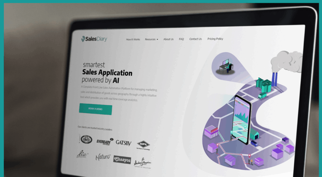
Application mockups showing the SalesDiary visual system deployed across website and product contexts.
Questions about this engagement
Common questions about brand identity design for B2B SaaS products and how First Launch approaches the process.
-
A complete B2B SaaS brand identity project includes keyword exploration and brand positioning, moodboard development to establish visual direction, logo design, a full colour palette and typography specification, a brand identity system with usage rules, and application mockups across real-world contexts — exactly the deliverables First Launch produced for SalesDiary.
-
First Launch began with keyword exploration — a strategic alignment exercise that defines the visual and tonal territory before any design work starts. This ensured the SalesDiary identity was rooted in differentiation from category defaults rather than simply well-executed aesthetics in isolation. Every logo concept was then evaluated against this agreed brief, not individual preference.
-
B2B SaaS identities must work across a much wider range of contexts simultaneously — from a mobile app icon to a conference banner — while conveying credibility and precision to enterprise buyers. They demand a more rigorous system approach compared to consumer brands, where emotional resonance alone can carry more of the weight.
-
Keyword exploration is a strategic alignment exercise, not a design exercise. It ensures every downstream design decision is evaluated against an agreed-upon brief rather than individual aesthetic preference. It also surfaces tensions in the brand's identity early — before they become expensive design revisions at the logo or identity system stage.
-
Yes. First Launch delivers complete brand identity systems for B2B technology brands, SaaS products, and enterprise platforms — from initial keyword positioning through to logo design, visual identity, and application mockups. Get in touch to discuss your project.
Explore More Case Studies
Take a look at First Launch case studies for tips & tricks on how to improve your own brand performance
A Bangalore interior design and construction studio went from zero search visibility to Page 1 rankings and 5.2x more impressions...
One content system change took Line of Thought from 105 to 235 followers — with 39% of the audience in...
A greenfield Google Ads build for a US health-tech education platform. First 30 days. 148.5 course sign-ups. 24.79% conversion rate....