Letting the Products Speak: Showroom Poster Design for Panasonic Homes & Living
A coherent wall-and-countertop visual system for Panasonic's new modular kitchen showroom — built around Japanese minimalism, designed to let the products be the centrepiece.
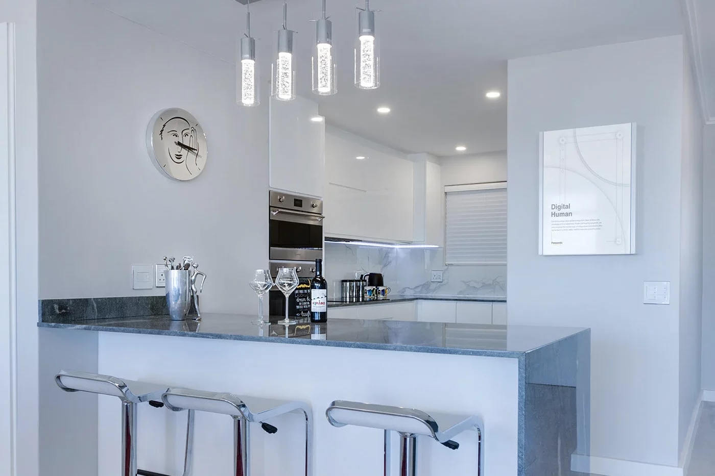
Japanese precision, Indian context
A new showroom needed an environmental design system worthy of a premium modular kitchen brand.
Panasonic Homes and Living, part of Panasonic Life Solutions India, brings Japanese technology and design philosophy to integrated residential solutions for the Indian market. Their modular kitchen range includes the L-Class — manufactured in Japan for premium residential projects — and the I-Class, tailored specifically for Indian kitchen layouts and lifestyles.
The brand sits at the intersection of Japanese precision and Indian practicality. That positioning carries significant implications for how it should look and feel in a physical retail environment. When they were opening a new showroom in Koramangala, Bangalore, with a dedicated modular kitchen display floor, they needed posters for the showroom walls and placards for individual product countertops — both working together to explain the products and communicate the innovation and technology behind them to a visitor in the moment of evaluation.
The design direction was unambiguous from the brief: keep it Japanese. Clean, modern, and minimal. The aesthetic needed to reflect the same design philosophy that makes Panasonic's modular kitchens distinctive — not loud, not cluttered, but considered and precise in the way that premium Japanese products are considered and precise.
Panasonic Life Solutions India
I-Class (India-specific)
A different standard than advertising
Environmental design for a premium product showroom operates under constraints that digital and print advertising don't share.
The visitor to a modular kitchen showroom is physically present in the space. They are moving through it, pausing at product countertops, reading at close range, absorbing the overall environment as an experience — not scrolling past it. Every design element on the wall and at the countertop contributes to the impression of the brand, either reinforcing its premium positioning or undermining it.
For a brand like Panasonic Homes and Living, whose premium credential rests significantly on its Japanese heritage, the design challenge was not simply one of visual appeal. It was a question of signal. Over-designed showroom posters — heavy with copy, competing graphic elements, and aggressive brand colour application — communicate anxiety, not confidence. The task was to create a visual system that communicated the opposite: that the products are good enough to let the design step back.
The two formats — large-format wall posters and close-reading countertop placards — had to function as a coherent visual system. The wall posters needed to create context and brand impression from a distance. The placards needed to deliver specific, detailed product information at the precise moment a considered buyer was examining the physical product itself. Both formats had to feel like they belonged to the same design vocabulary without becoming repetitive.
Restraint as the design strategy
The Japanese minimalist aesthetic that guided this project works because it communicates confidence — the product is good enough to let the design step back.
First Launch designed the wall posters to explain each product's features and the technology behind it — structured to be informative without being text-heavy, and visually engaging without being merely decorative. The typographic hierarchy was carefully controlled: enough structure to guide the eye, not so much as to feel over-designed. Whitespace was used as a primary compositional element, not a gap-filler.
The countertop placards were designed for closer reading at the point where the visitor was examining the physical product. At that moment, the design's job changes: the brand impression has already been established by the environment; the placard now needs to deliver the specific detail that a considered buyer needs — without breaking the visual tone of the space they are standing in.
The clean typographic hierarchy, controlled use of space, and restrained visual language across both formats reflected the Japanese aesthetic brief directly — in the same way that the Panasonic kitchen products themselves are designed: nothing unnecessary, everything purposeful.
What the engagement covered
Three interlocking components, designed as a single visual system.
- Large-format showroom wall design for the Koramangala location
- Feature and technology communication structured for distance reading
- Informative without text-heavy composition
- Creates brand impression and contextual atmosphere across the floor
- Product-specific collateral for individual kitchen display counters
- Designed for close-range reading at the point of evaluation
- Detailed product specifications and technology information
- Applied across L-Class and I-Class modular kitchen ranges
- Japanese minimalist aesthetic — clean, modern, restrained
- Coherent visual language across both large and small-format applications
- Controlled typographic hierarchy and purposeful use of negative space
- Nothing unnecessary, everything purposeful
See the full project
The complete visual system on Behance.
"The product is good enough to let the design step back and let it speak."
Questions about this engagement
Common questions about showroom poster design and environmental design for premium product spaces.
-
Environmental design for a showroom refers to the visual system of printed and displayed materials — wall posters, countertop placards, signage, and print collateral — that collectively shape how a visitor experiences and understands the brand and its products in a physical space. Unlike advertising, it is designed for someone who is physically present and potentially making a high-value purchase decision.
-
First Launch designed a complete wall-and-countertop visual system for Panasonic Homes and Living's modular kitchen showroom in Koramangala, Bangalore. This included large-format wall posters explaining product features and technology, and countertop placards for close-range reading at individual product displays — all built around a Japanese minimalist design language consistent with the brand's identity.
-
Panasonic Homes and Living's premium positioning is anchored in Japanese engineering heritage. The brief called for a design language that reflected the same values as the products themselves — precision, restraint, and purposeful design. A Japanese minimalist aesthetic communicates confidence: the products are good enough to let the design step back. Over-designed showroom materials communicate anxiety, not premium quality.
-
Wall posters are large-format pieces designed to create brand impression and context from a distance — they communicate a product category's key features and technology at a glance. Countertop placards are smaller-format pieces placed at individual product displays, designed for close-range reading and delivering the specific technical detail that a considered buyer needs when actively evaluating a product.
-
First Launch provides end-to-end environmental design and print collateral services, from concept and design system development through to print-ready file production. For production and print vendor management, we work with trusted print partners and can guide the process depending on the scope of the engagement.
-
Yes. While this engagement was for a Koramangala, Bangalore showroom, First Launch works with brands across India on environmental design, showroom visual systems, and print collateral. The design and production process works effectively regardless of location.
Explore More Case Studies
Take a look at First Launch case studies for tips & tricks on how to improve your own brand performance
A Bangalore interior design and construction studio went from zero search visibility to Page 1 rankings and 5.2x more impressions...
One content system change took Line of Thought from 105 to 235 followers — with 39% of the audience in...
A greenfield Google Ads build for a US health-tech education platform. First 30 days. 148.5 course sign-ups. 24.79% conversion rate....