Importance of Colours in Branding
by First Launch on Thursday Jan 11
93% of customers’ decisions are influenced by the visual appearance of the product and website. 70% of customers will not purchase a product if they dislike the colour. 80% of the brand’s success relies on the correct combinations of colours.
You only have 8 seconds to attract a customer, and during this short time, only colour can draw in the visitor.
Some colours may have a negative impact on customers. These colours include grey, brown, and orange. Grey is unofficially regarded as the colour of the interface, discouraging action. Brown generally carries negative senses for the majority. While orange might be suitable for button applications, it’s not ideal as the primary colour for the entire resource as it can irritate people more than even RED.
When choosing colours, consider the industry you operate in. Colours associated with ‘Coca-Cola’ may not be suitable for banking, medicine, or pharmacy.
RED – is effective in the food and entertainment industries, techniques, transport companies, and agriculture. Brands such as “Coca-Cola”, “Colgate”, “Kellogg’s” “Netflix”, “Tesla”, and “Marvel” have already experienced the power of this colour.
GREEN – is often linked with nature, growth, vibrancy, and harmony. It can convey feelings of tranquillity or energy, depending on the shade. Brands often use green in their logos or branding to evoke feelings of environmental friendliness, health, or growth. Some examples of brands using green in their logos or branding include “Starbucks”, “Spotify”, “Tropicana” “Android”, and “WhatsApp”.

BLUE– In the realm of light, it’s one of the three primary additive colours, along with red and green, from which a wide array of other colours can be created. In almost every sector, blue is a colour except for the food industry. It can be considered universal (even daltons can see it). Brands utilizing this colour include “Facebook”, “LinkedIn”, “Ford”, and “PayPal.”
ORANGE – this colour is for companies that are oriented on healthcare, food, transport, logistics, and technique. Orange is not exactly the colour that matches with other colours and in case of the wrong combination, it may turn into a disaster. Brands that use this colour are: “Fanta”, “Harley-Davidson”, “Nickelodeon”, and “Gulf Oil”.
BLACK – is the predominant colour. It commands attention and using it in website designs can be risky. Have you ever observed that world-famous fashion houses like “Zara”, “Gucci”, “Prada”, “Dior”, “Chanel”, “Louis Vuitton”, and “Versace” opt for black in their branding? This colour is linked with refined taste. However, remember that utilising black on websites is deemed acceptable only for such major brands that set the overarching tone within the fashion and design industry. It’s an ideal colour for fashion and transport/logistics but not advisable for food and health-related industries.
These brands, among others, leverage black to communicate a range of qualities from luxury and sophistication to power and reliability, depending on their specific brand identities and target audiences.
PURPLE – This colour is associated with health and beauty more than any other colour. However, purple is not good for energetic or agro-industries. It is preferable to use it for industries like cars, aeroplanes, household items, or anything connected to providing services. Brands that use this colour are: “Yahoo”, “FedEx”, “Twitch” and “Cadbury”.

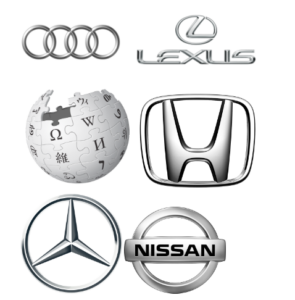
WHITE AND SILVER – colours of perfection and purity. Classic black and white have been frequently used in the fashion industry and websites for techniques or transportation. Such a design doesn’t require much change over the years. Brands that used its effect are: “Mercedes Benz”, “Ralph Lauren”, “Forbes”, and “Honda”.
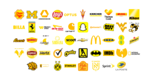
YELLOW – is the colour of happiness, motion, intelligence, and development. We can say that this colour is optimal for energy and food businesses. Brands that chose this colour are: “Nikon”, “Snapchat”, “IMDb” and “IKEA”.
Colours have the power to convey a brand’s philosophy subtly, influencing perceptions and fostering connections on a subconscious level.
Would you like to show that your product is for those who have been chosen? Then use black.
If your product embodies perfection and purity, opt for white.
Looking for more attention? Use red or orange.
Want to bring beauty and glory? Purple is the way to go.
And don’t forget!!! Don’t be afraid of experiments.
If you’re seeking to elevate your brand’s visibility, First Launch could serve as your comprehensive solution for all your design and branding needs. Operating as a full-service branding agency in Bangalore, India, First Launch specializes in aiding businesses and startups in visual growth.

